STUDENT PORTFOLIO
VARIOUS MEDIA
VARIOUS MEDIA
These are a selection of the finished pieces produced during my time as a student. Most are created with Adobe Illustrator and Photoshop, though there are a few pieces done with more traditional media.
In many of them I've tried to create a sense of the absurd though there are a few that are more serious.
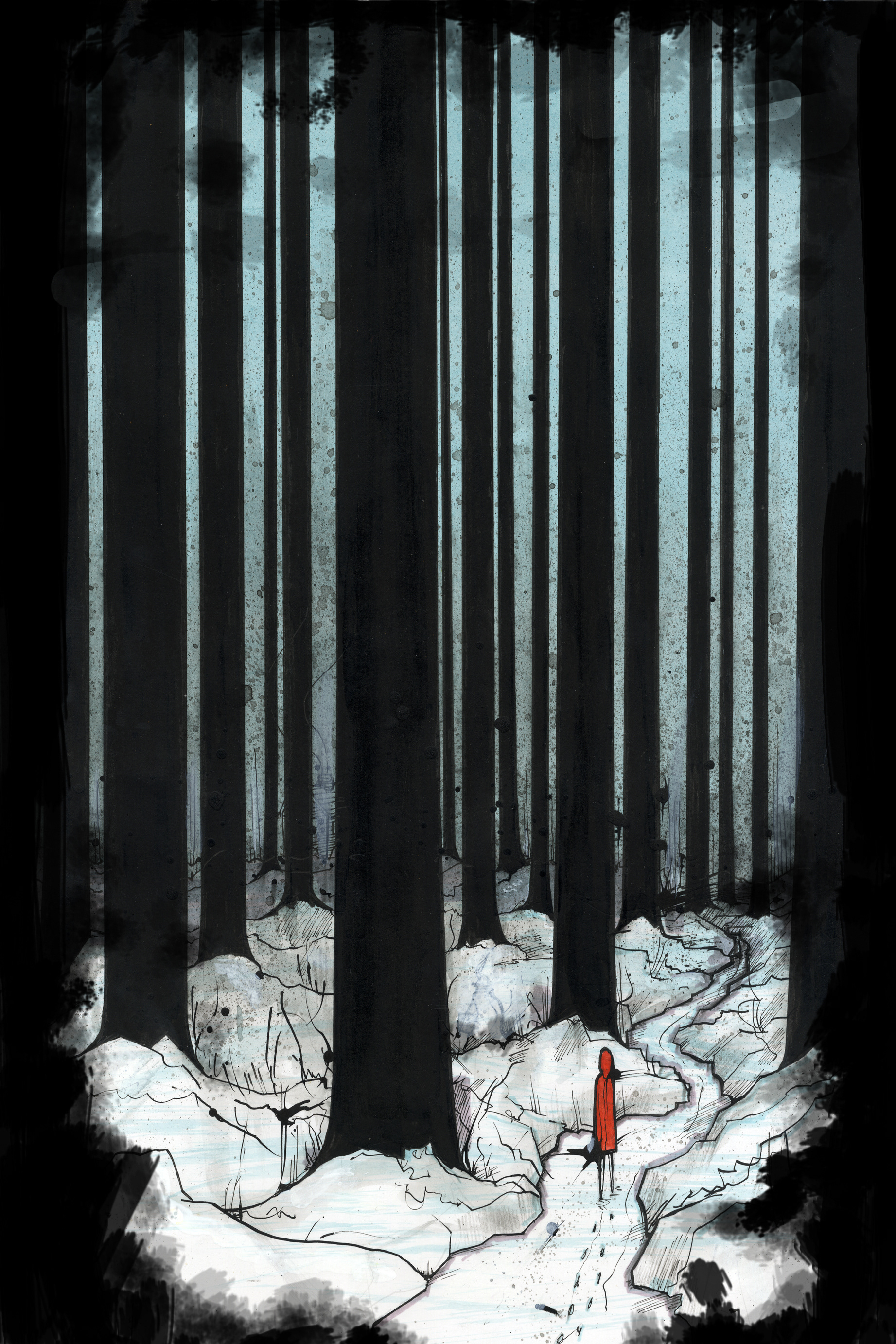
COMPANY OF WOLVES (2012)
Illustration for A Company of Wolves from Angela Carters The Bloody Chamber.
It is based on the part of the story where she is alluding to the story of Red Riding Hood (albeit in a very adult way)
I wanted to try and capture the bleakness of the forest she was describing. I was remind of Scandinavian wood cuts, black metal album covers (also Trentemoller's The Last Resort) and the work of John Kenn.
I wanted to keep a simple colour palette (which for me is rather difficult.) Muted watercolour/gouache blues, greys, greens with black and white...then a small area of red for Red Riding Hood. This might be considered a bit obvious, but I liked the contrast.
Watercolour/gouache. Dip pen and ink. Alcohol markers.
Resized and black borders added in Photoshop
EASYJET WEBSITE LOADING SCREEN (2011)
This was produced as part of a project in which the brief was to come up with an animated loading screen for 1 of 3 companies : Adidas, Coca Cola and easyJet. I decided to go with easyJet due to my love of transport.
After much faffing about drawing pictures of Boeing 737s I started playing around with the idea of having the plane appearing in bits, which then led me to styling it like an airfix kit.
Ideally I would have actually made an the animation using an actual Airfix kit, but due to cost constraints I worked directly from some Boeing 737 blueprints.
Tried to keep it as simple as possible utilising the easyJet corporate colours (orange and white) going for a blueprint sort of look to it
Adobe Flash (exported as GIF)
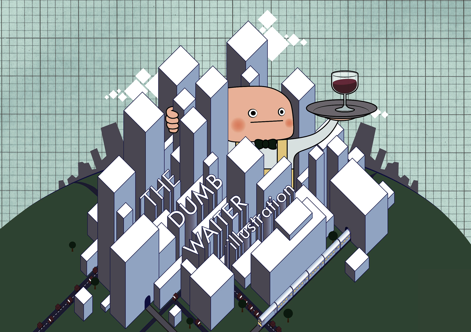
THE DUMB WAITER ILLUSTRATION (2011)
I've been working under the Dumb Waiter moniker for a number of years. I set up my first (and) only hotmail address with when I was 12. Rather than being a reference to the Harold Pinter play, it is a reference to a sign in the game Thief which stated "employees must not ride the dumbwaiter." I found this to be hilarious at the time and it kind of stuck.
I needed to formalise some sort of branding which incorporated this name and this was the result.
It includes my love of isometric projection, transportation and cityscapes.
Illustrator
Photoshop
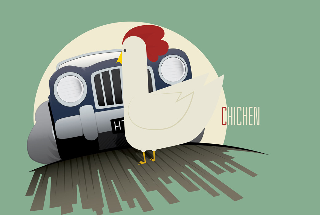
CHICKEN (2011)
I thought I'd play with the classic "why did the chicken cross the road?" joke (I use both the term "classic" and "joke" very loosely.) It started off with a chicken crossing the road and holding up traffic, which then lead on to a chicken playing chicken.
Hardest parts were probably the perspective on the road and making the chicken's feet point in the right direction.
Hardest parts were probably the perspective on the road and making the chicken's feet point in the right direction.
Illustrator
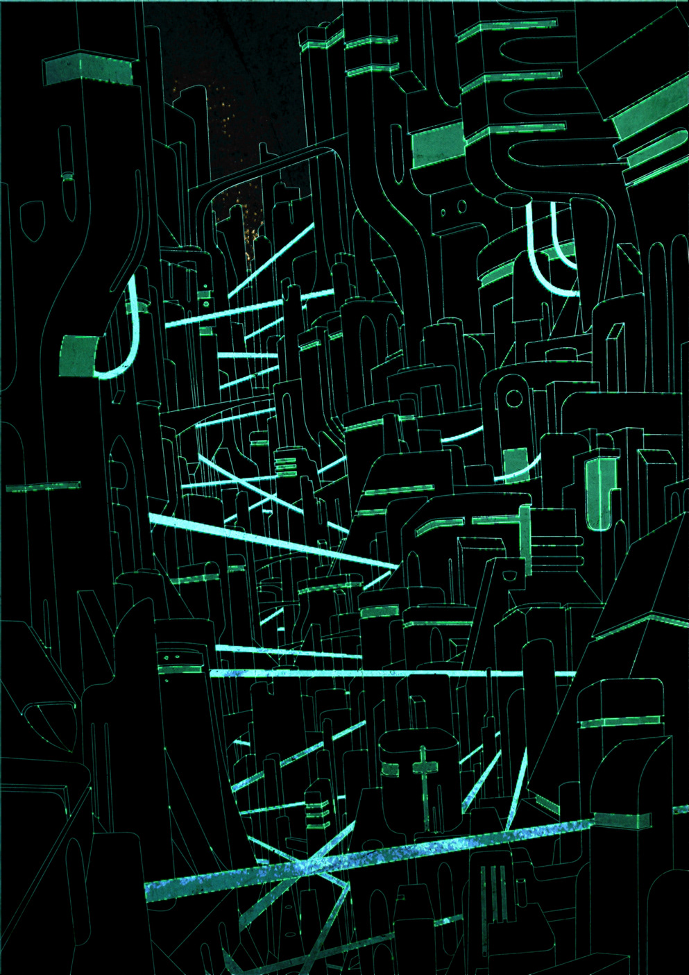
VISIONS OF THE FUTURE (2011)
I decided I need to draw the future. I then decided that drawing wasnt enough so I vectored my drawing.
I then spent many hours copying and pasting the same image onto itself in photshop playing around with "Hard Light" and glowing. The outcome seems to be a mix between Eve Online, Beneath a Steel Sky and Tron (which I haven't seen)
This has taken a long long time to do, but then thats a lot to do with not knowing what to do after the initial linework in Illustrator (it was original blue line on white, which I might continue with on another version)
I'm not sure whether it is finished yet
Illustrator, Photoshop
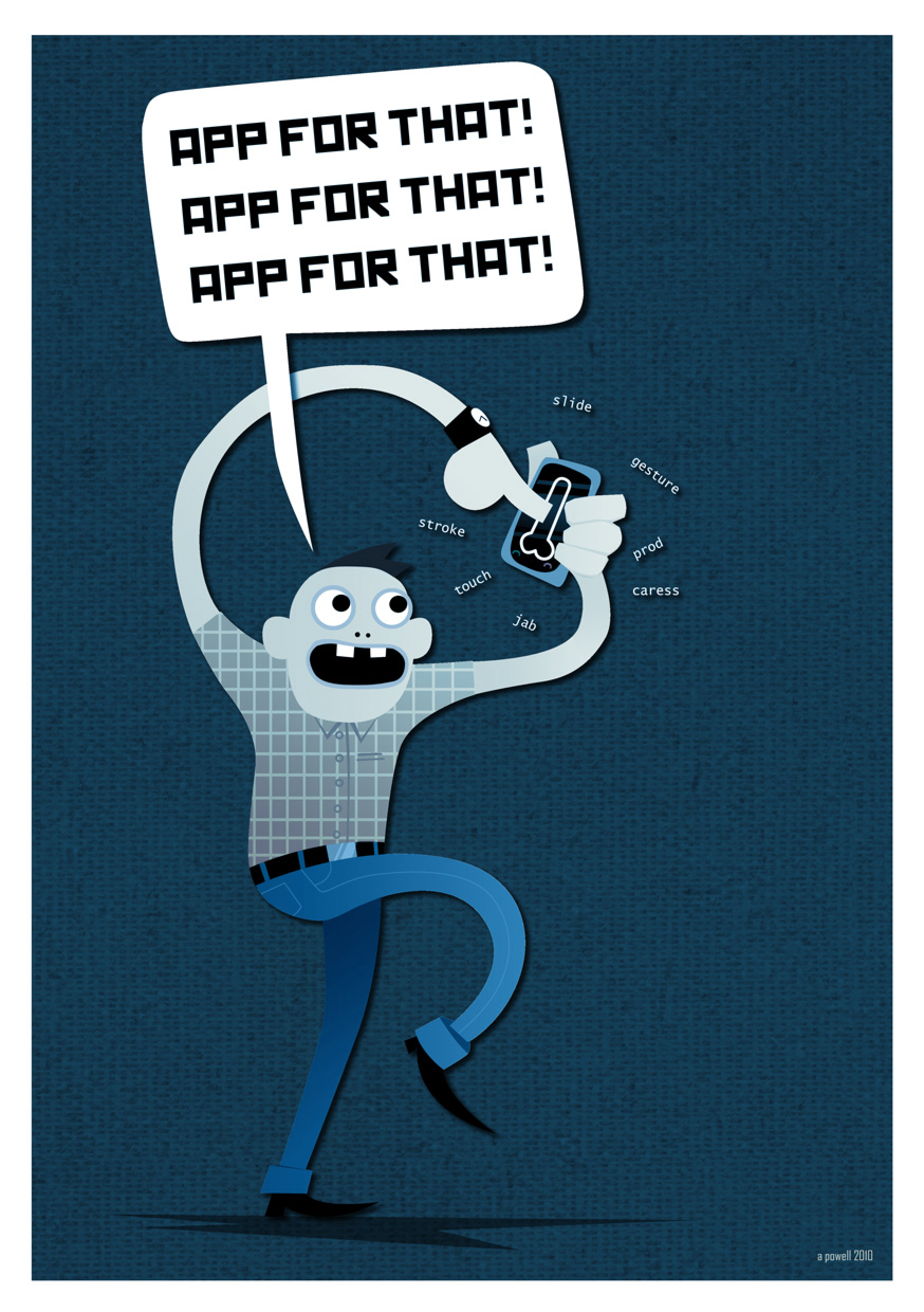
THERE'S AN APP FOR THAT (2010)
Thought I'd make fun of smartphones (even though I do own one)
What I want to know is how long it takes for someone to say "There's an app for that" seriously (as in with no hint of irony)
Slightly different approach here.
Pen tool in Photoshop, which I've never done before.
Canvas texture
Blue overlay used, but can be changed for different colours, perhaps for use in a range of limited prints.
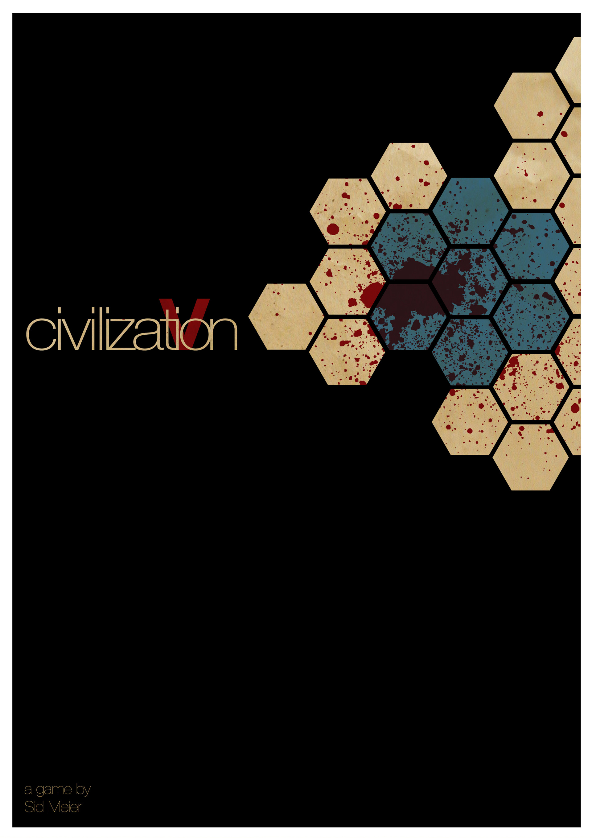
CIVILIZATION V ALTERNATIVE COVER (2010)
Been playing a little too much Civilization 5 since its release last Friday and its had a detrimental effect on my sleep pattern!Whilst not playing it I found this book cover http://www.aisleone.net/2010/design/julian-montague/
I thought to myself "Hey that would make an awesome alternative/retro cover for Civilization 5.
Then found there was a whole series of these pictures that exist http://kotaku.com/5145909/a-second-serving-of-classic-reimagined-game-covers
This is my attempt
Illustrator and brown paper
Then found there was a whole series of these pictures that exist http://kotaku.com/5145909/a-second-serving-of-classic-reimagined-game-covers
This is my attempt
Illustrator and brown paper
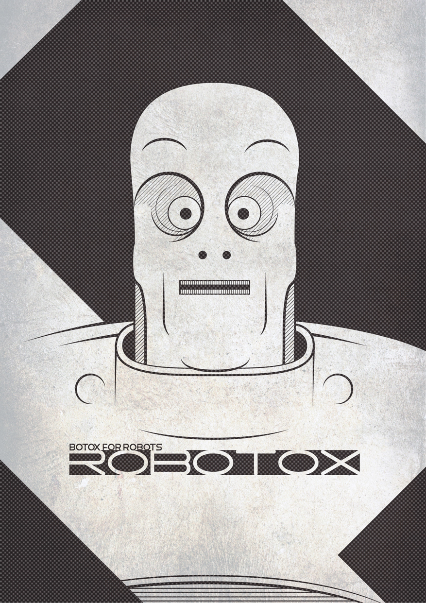
ROBOTOX (2010)
Had this as a little doodle in my sketchbook for the last year so I thought I'd make it a poster
Illustrator (and the infuriating Snap-to Grid)
Photoshop (for texture overlay, half-tone and colour correction)
Illustrator (and the infuriating Snap-to Grid)
Photoshop (for texture overlay, half-tone and colour correction)

FAMILY GAMES NIGHT (2010)
Pretty sure most people have been in this situation when it comes to playing board games and with the festive period approaching it seemed rather appropriate.
Originally the swearing was there in all its glory but I changed it to the "family friendly" version and it seemed to have more impact. Maybe I've been desensitised?
Starting to get the hang of the Photoshop pen tool and dare I say it I'm starting to prefer it! The grids align for one thing!
Thought I'd avoid the use of textures and filters this time. Keep things simple.
Photoshop
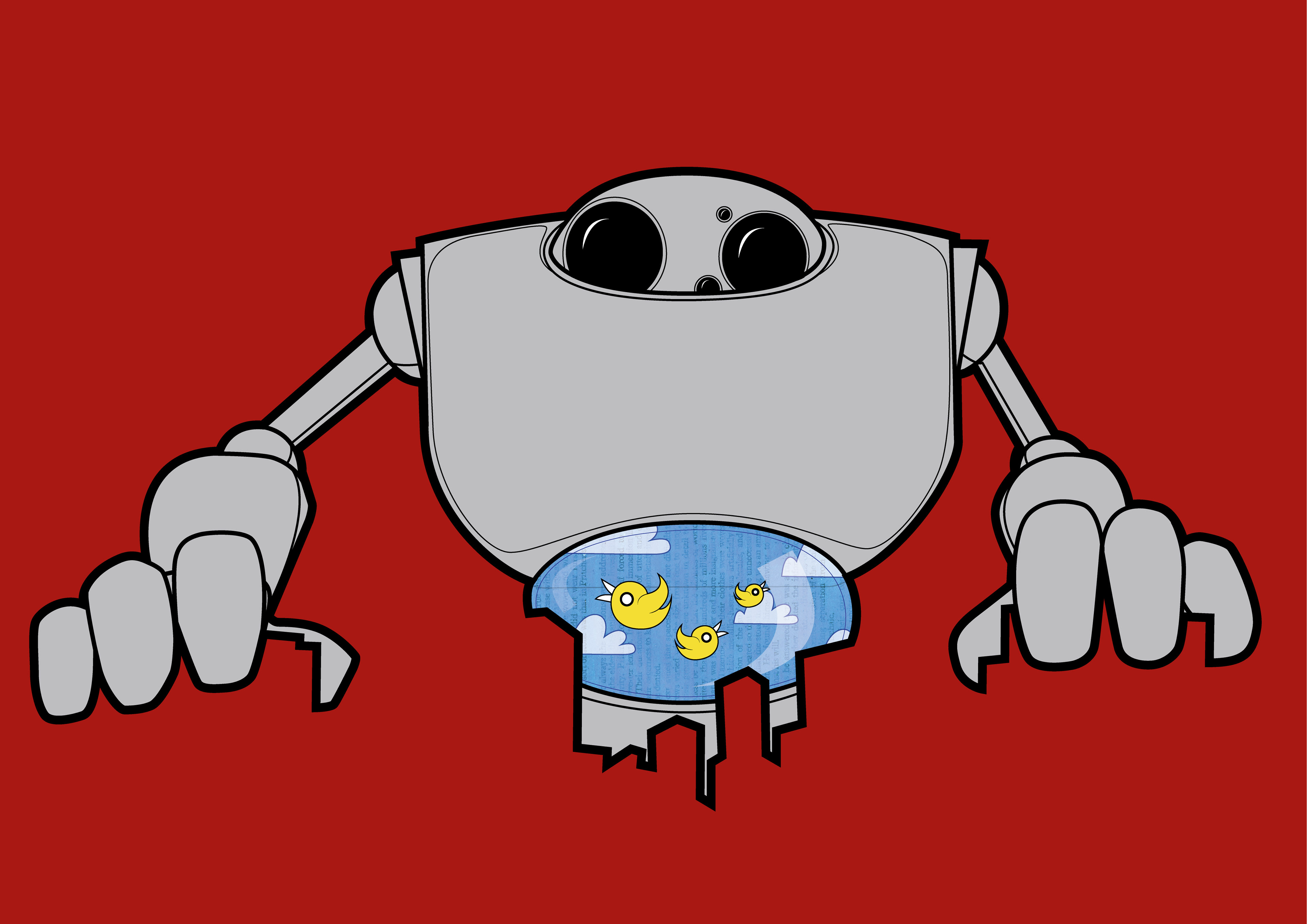
CAGED (2010)
A piece for the Illustration Friday word "caged"
A robot with birds caged in it's "stomach." In a sort of Iron Giant reference it wanted to suggest that robots could have pets and friends ( a running theme it would seem with my work)
I wanted to play around with negative space so I used this to suggest a city skyline.
There are a few strange lines which need tweaking (around the left thumb) and the birds are very large compared to the size of the building.
Illustrator
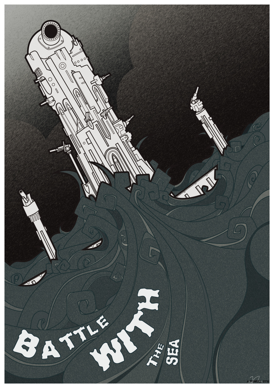
BATTLE WITH THE SEA (2010)
A one off poster-sized image depicting mans eternal struggle to destroy the sea. The product of wine and shouting abuse and throwing stones at the sea...like all normal people should!
Originally this was intended to be part of a series showing monolithic architecture coming out of the sea. I may return to this idea at some point and refine it.
I'm nit entirely happy with the font chosen here. It would have probably been better to have drawn the text by hand.
Illustrator
Photoshop
Illustrator
Photoshop

POGO SOLDIER (2009)
Part of a series of t-shirt designs which had soldiers playing with children's toys. The original picture in the series was a German WW2 soldier riding a space hopper, though I felt this a little too cartoony. As a result with this piece I decided it needed to be simpler using only black line work, white and one solid colour (which could be interchangeable.)
The star needs to be recoloured as there appears to be a gap in the colour (not apparent until printed on t-shirt)
Illustrator
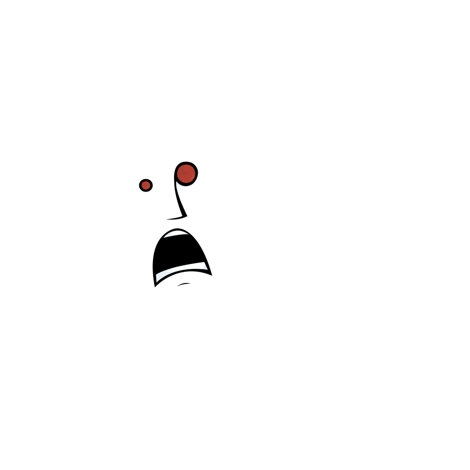
TRUE HORROR (2009)
Originally a piece drawn in 2005 I thought I'd vector it as a way of improving my Illustrator skills.
I wanted to play with exaggerated facial expressions on white space and this was the result.
I think it was a response to "polar bear in a snowstorm" joke
Illustrator